Launch Your Dream Site in 7 Days!
Learn More
Feb 20, 2025
Web Design
Setting the Tone for Your Website
The hero section is the digital front door of any website, setting the tone for everything that follows. Capturing attention in an instant and drawing users in is the main goal. A killer hero design strikes the perfect balance between aesthetics and function, showcasing the brand’s core message with clarity. Imagery, typography, and a strong call to action turn visitors into users. João, our founder, has explored new directions in hero design, balancing creativity and clarity. Take a look at some of his Hero Section designs explorations that he posted on X @joaoconradd
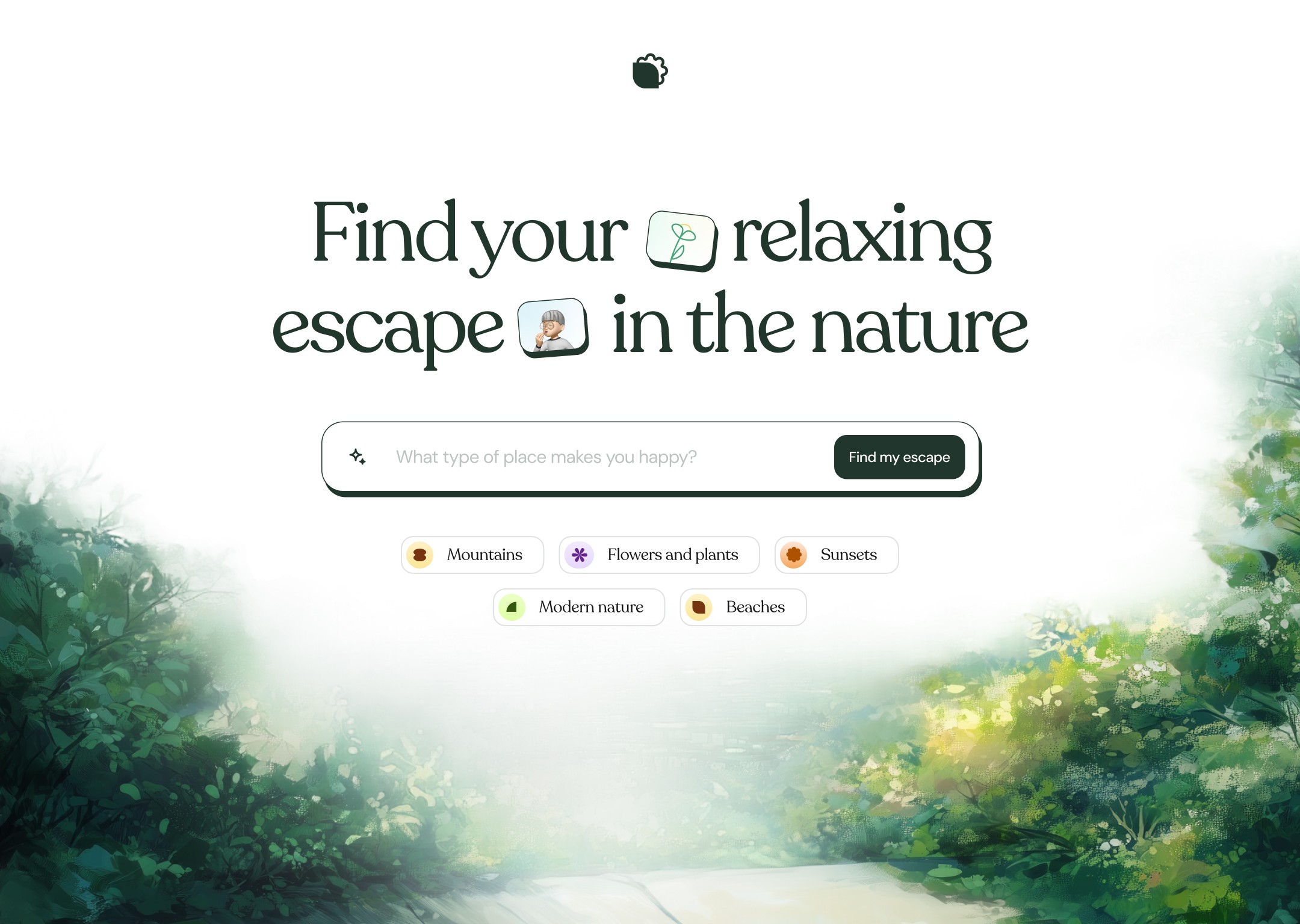
Calm, nature-inspired design
This hero section has a peaceful, nature-inspired vibe. The headline, "Find your relaxing escape in the nature," uses playful emojis, creating a friendly tone. The design is clean, inviting, and easy to navigate, offering a relaxing experience.

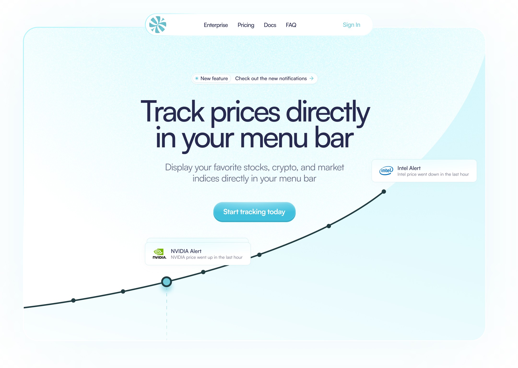
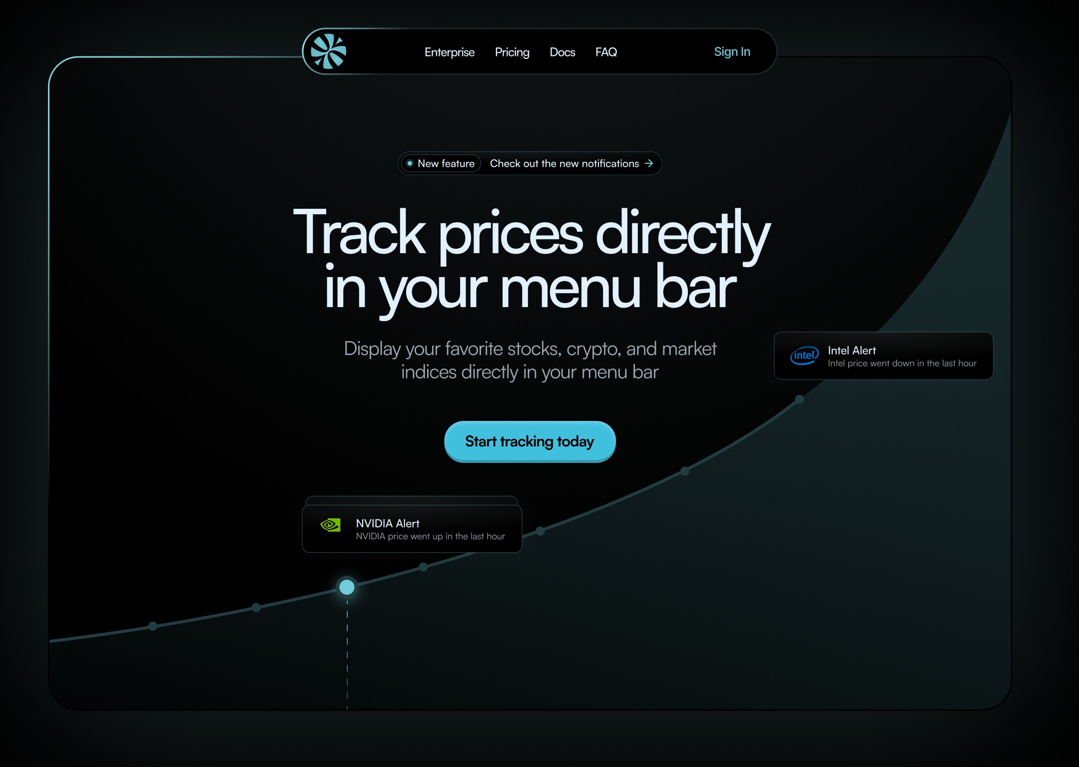
Versatile dark and light modes
This hero section shows the versatility of modern design with both dark and light modes. The dark version uses deep blacks and turquoise highlights for a sleek, tech-forward feel, while the light version offers a crisp white background with soft blue gradients, creating a fresh, approachable look. Both versions clearly convey the message of tracking prices, with a bold headline, product explanation, and a bright call-to-action button, no matter the user's preference for dark or light mode.


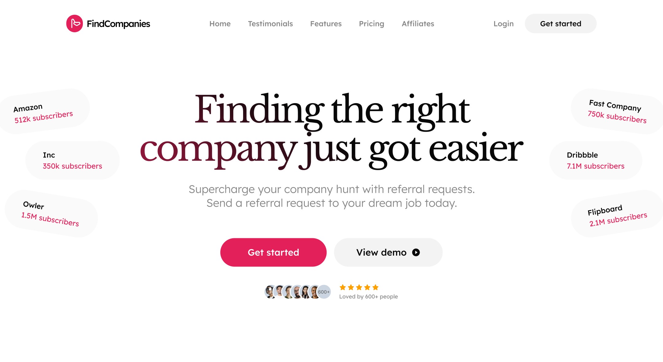
Clear Calls to Action
"Finding the right company just got easier," stands out in bold typography, immediately grabbing attention. The page highlights major brands like Amazon, Inc, and Dribbble, showcasing their subscriber counts to build trust. Below the headline, a clear subtext invites users to send referral requests to their dream jobs, making the purpose of the site unmistakable. This design is straightforward, with a focus on user engagement, making it easy for users to take the next step in their job hunt journey.

Hero Sections to Modern Needs
These hero section examples showcase how modern design can adapt to different needs while maintaining clear communication. From nature-inspired calm to tech-focused functionality, and job-hunting solutions, each design serves its purpose through thoughtful layout, color choices, and user-friendly elements. The key to a successful hero section lies in finding the sweet spot between visual appeal and practical usability, creating that perfect first impression that guides users naturally to their next action.
Related articles
